Equicare
Challenge
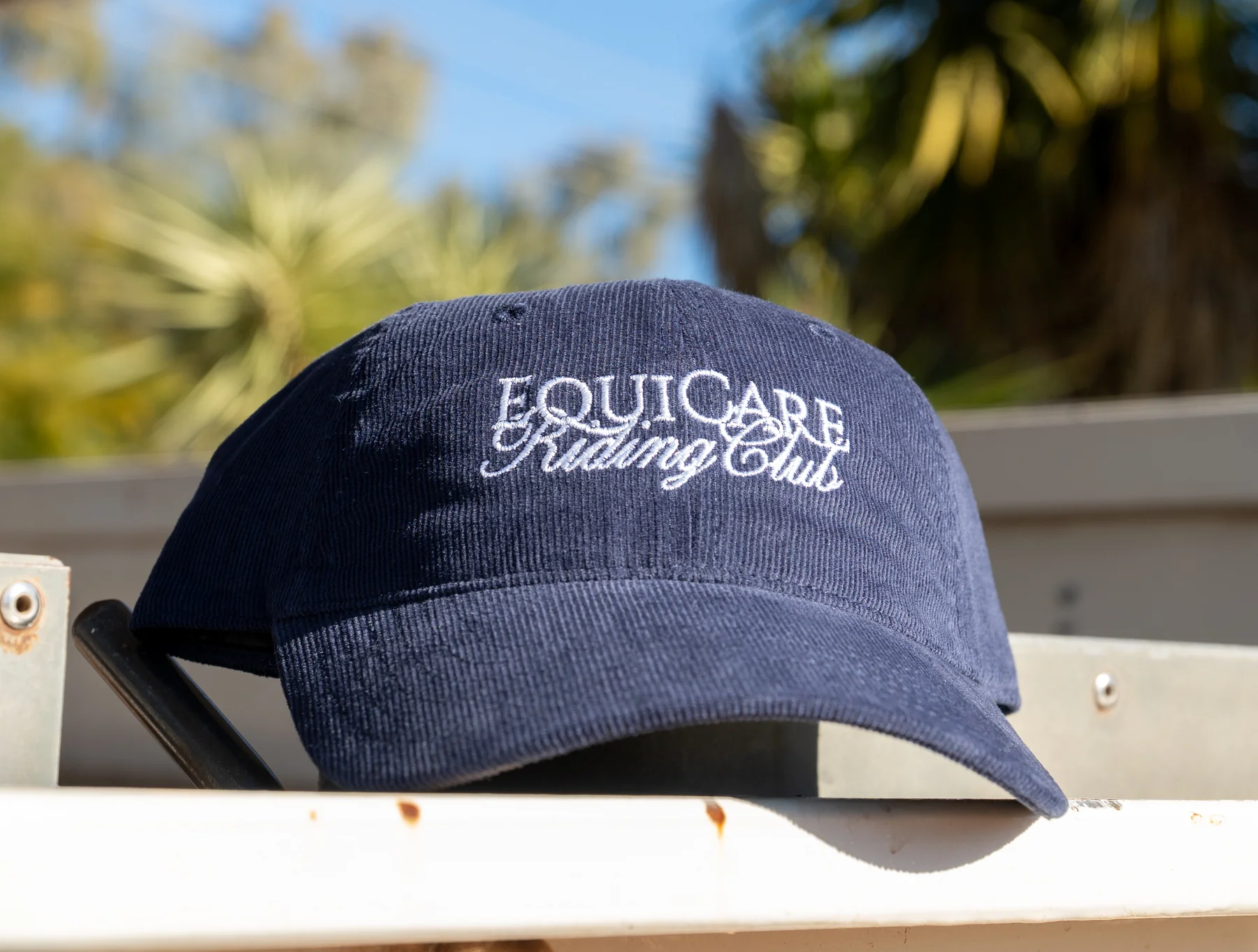
Equicare didn't want branded uniforms. They wanted apparel their customers would actually choose to put on.
Typography-led, aesthetic-forward, with no company logo doing the heavy lifting. That's a harder brief than it sounds - the design has to earn wear, not just carry the brand.
Goal
Create apparel the Equicare customer would choose to buy and wear, not just receive.
A suite that felt like real leisurewear - developed through a genuine creative process with the client, not just applied branding.

Solution
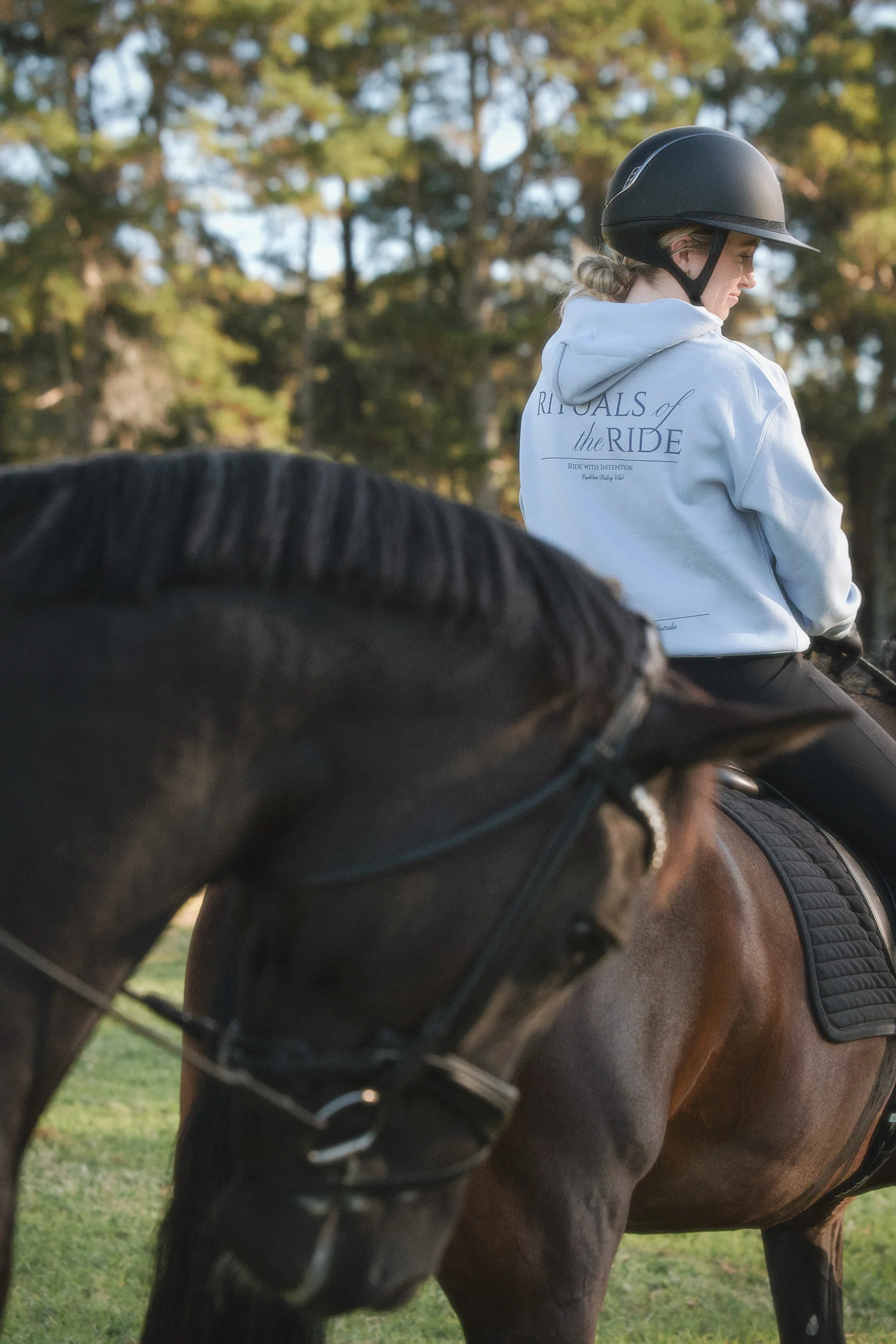
We proposed taglines, mocked up the options and let the client choose what felt right.
The final suite was applied across tees, hoodies and sweatpants in two colourways - then shot in a professional shoot the client commissioned separately. The images are genuinely good. A follow-up tee with bespoke typography commemorated a joint event with a partner brand. Same approach: the type does the work, the brand stays in the background.
